
Every day, dozens of emails pile up in our inboxes, be they newsletters, promotions or information messages. In this context of overabundance, it becomes more complex for a sender to capture the recipient’s attention. Many people focus on the subject line of an e-mail, thinking that it’s all a matter of a few words. It’s true that a well thought-out sentence can trigger a message to be opened, but it’s not the only parameter that counts.
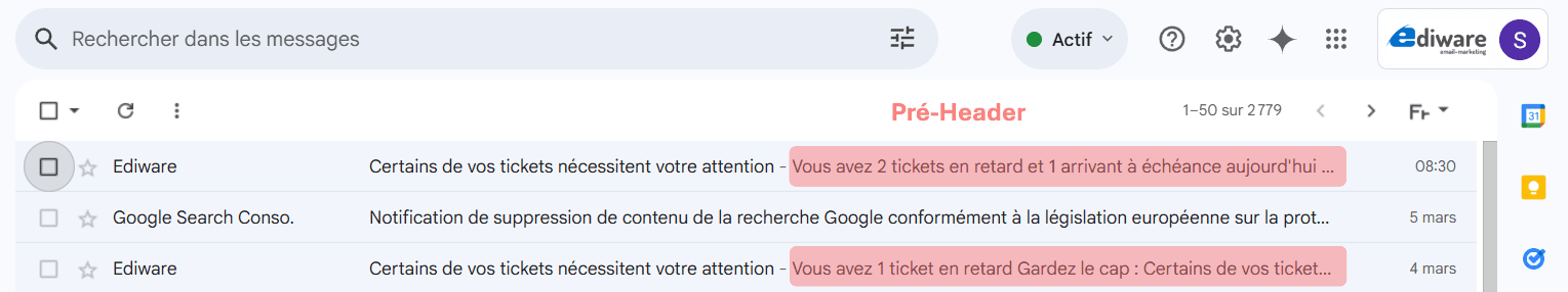
The pre-header, that short line of text that extends the object in the preview list, often proves decisive in encouraging the reader to go further. Yet all too often, it is neglected, or even left at its default value. And yet, attention to this element can literally transform a campaign’s performance: in a matter of seconds, the recipient sees not only an eye-catching object, but also additional information that encourages them to click. It’s a crucial detail, but one that makes all the difference in breaking through the flood of incoming e-mails and inspiring the desire to find out more. In the following paragraphs, we’ll explore in detail what a pre-header is, its benefits and the best practices for making the most of it.
What is a pre-header?
The pre-header, sometimes called “preview text”, is the short portion of text you see just after the subject of an email in your inbox. When a recipient flies over their list of messages, they first see the sender, the subject line, and underneath or next to it, this famous pre-header. This area is therefore invaluable for inserting additional information or a teaser to extend the subject line.
In concrete terms, if the subject line stops at a promise or a question, the pre-header takes over by providing a clue to the content, arousing curiosity or adding an element of personalization (for example, the recipient’s first name or a reference to previous interactions). From a technical point of view, the pre-header is a short extract defined in the HTML code of the email, to prevent the recipient’s mailbox from displaying automatic text such as “Click here to view this email”.
The pre-header can be seen as the email’s “second hook”. If the subject line arouses initial interest, the pre-header reinforces the desire to click. It’s an additional opportunity to make the reader want to open the email, rather than letting it disappear into the mass of unread messages.
Why is it essential to treat it?
Careful pre-heading gives you an extra opportunity to convince the recipient that your message deserves their attention. While the subject line of an e-mail is often limited to a few words, the pre-header allows you to add a phrase, a teaser, an emotional appeal or a personalizing element that will strike a chord with the reader. In other words, you take advantage of an additional communication space to remove doubts, add value or simply increase curiosity.
This role is fundamental to the open rate: the more coherence or interest the recipient finds in the first two lines (subject and pre-header), the more inclined they are to click and read the rest. This impact is all the more marked at a time when the majority of people consult their emails on mobile: the preview is often reduced to the sender, the email subject, and a few words in the pre-header. It’s therefore a “showcase” that needs particular attention.
Beyond the purely marketing aspect, a well-written pre-header also illustrates the care given to the relationship with its audience. It shows a certain attention to detail, which builds reader confidence and can lead them, campaign after campaign, to open your next emails more willingly.
How do you set it up (and make it a success)?
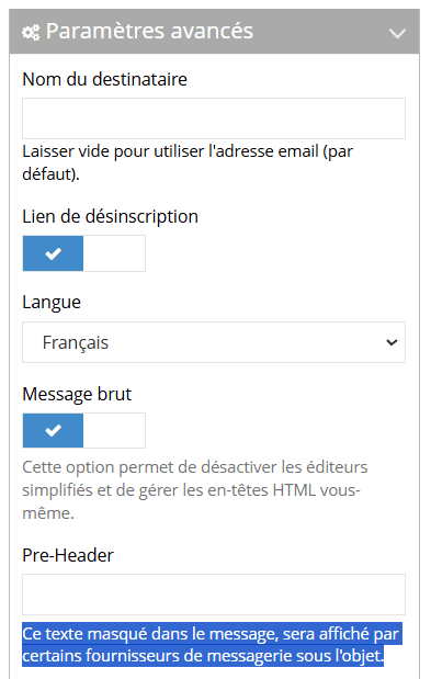
To take full advantage of the pre-header, it’s crucial to understand the mechanics behind its creation and display. In concrete terms, you’re going to insert a short line of text into the HTML code of your email, which most email clients will spot and display below the subject line. This line should appear at the very beginning of the code (in the “head” section or just after), often in the form of hidden text to prevent it from visually cluttering the email once opened.
From a technical point of view, there are a few best practices to bear in mind:
- Limited length: most mailboxes truncate the pre-header beyond a certain number of characters (generally between 50 and 100, depending on the customer and the device). So it’s best to get straight to the point, without unnecessary chatter.
- Consistency with the object: the pre-header should naturally extend the object. If there’s a promise in the object, extend it. If there’s a question, answer it in part, or bring in something that sparks interest.
- Personalization: if you have information about the recipient (name, business, previous purchase), integrate it in a subtle way to make the message more “human”.
- Respect the basic rules: avoid spammy wording, exaggerations or flashy symbols that could alert e-mail filters.
Finally, before sending out a campaign, it’s essential to test the display of this pre-header in the main environments. Ediware offers, for example, a dedicated tool that lets you quickly visualize your email as it will appear in desktop (Outlook, Gmail for PC…) and mobile (iOS, Android…) messaging, to spot any text breaks and ensure optimal rendering.
Common mistakes
Despite the importance of the pre-header, it’s still common to see campaigns where this element is treated lightly. One of the first mistakes is to leave the “default” pre-header, i.e. the one automatically generated by the e-mail system, such as “Click here to view this e-mail” or “Can’t read this e-mail? You can even leave it blank. The pre-header will then be the beginning of the message, generally “Hello Mr…”.
Not only does this add no value for the recipient, it can also give the impression of amateurism.
The second classic mistake is repeating the object word for word. If the object stated “Promotion on our new products”, there’s no point in repeating exactly the same sentence in the pre-header. It adds nothing, except the sensation of having a “copy” following the object.
Some marketers also leave technical characters or coding indications visible, such as a sequence like “%firstname%” that has not been correctly substituted. Or they include poorly optimized keyword strings in the pre-header, which are immediately perceived as spam by the recipient.
Finally, neglecting the mobile display is a major mistake. A pre-header that exceeds the limits imposed by a smartphone screen risks being cut off or illegible. The same is true if compatibility has not been tested on different e-mail clients. All these factors considerably reduce the effectiveness of the campaign.