When redesigning the interface of a B2B emailing platform used by professionals on a daily basis, it’s tempting to follow trends. Round everything off, flatten everything out, whitewash everything. As many SaaS providers have done in recent years, confusing minimalism with a lack of personality.
We made a different choice.
The latest version of Ediware doesn’t look like what you see everywhere. That’s by design. Here are the visual biases that guided this redesign, and why each exists for a specific reason.
In short: Ediware adopts a visual identity that assumes the functional density of a professional tool. Neo-Brutalist square corners, tactile gradients, semantic palette with purple for AI and outlined icons. Each choice responds to a need for efficiency, not decoration.
Controlled density, not trendy emptiness
Ediware isn’t a tool you discover once a month. It’s a tool you live with. Email, SMS, voicemail deposits to mobile messaging: functional richness is an asset, not a problem to be masked. And when your teams spend several hours a day working on an interface, every pixel counts.
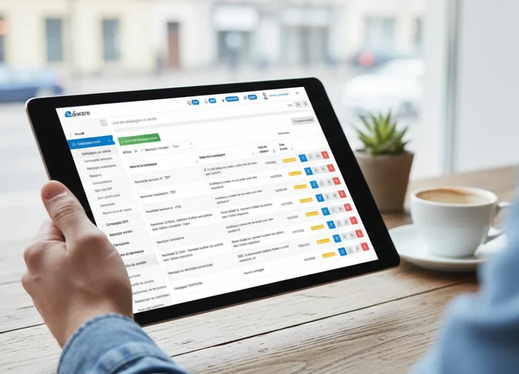
The three-column architecture – navigation, content, settings – provides simultaneous access to all the dimensions of a campaign without superfluous navigation. Everything is there, in its place, visible. No hidden menus, no useless clicks to reach a setting. That’s the heart of our emailing platform: giving access to everything, without forcing you to look for it.
According to a 2024 Pentagram study, 63% of SaaS users no longer distinguish one interface from another. Lazy minimalism”, as designers call it, has created a web where everything looks the same. Rounded corners everywhere, soft shadows, pastel colors, the same components used over and over again. We’ve taken the opposite approach. Well-organized information density is a comfort. Not a flaw.
Buttons between neo-Brutalism and Neumorphism 2.0
The buttons are based on two strong choices.
First choice: square corners, border-radius at 0 pixels. This is the language of the neo-brutalist movement, which has been rejecting the “all rounded” dominance of UI design since 2019. Gumroad, shadcn/ui and a whole generation of tech products have adopted this aesthetic. The Nielsen Norman Group defines it as “a visual trend of high contrasts, blocky layouts and deliberately raw elements”. What we see is, above all, directness. Clarity rather than decorative softness.
Second choice: subtle gradient backgrounds at 135°, in the spirit of Neumorphism 2.0. This trend responds to flat design fatigue by reintroducing tactile depth, without falling into the skeuomorphism of the 2010s. Every button has a slight volume, a discreet relief that makes it tangible to the eye. You click on something that seems to exist.
These are not accidental choices. It’s a synthesis of two contemporary trends that complement each other: the geometric rigor of brutalism and the subtle materiality of neo-morphism. Not retro, not avant-garde for the sake of it. Just coherent.
A palette that speaks users’ language
The color palette is based on the modernized Bootstrap system, enriched with semantic colors specific to our sector.
Blue supports primary actions and brand identity. Gray accompanies secondary and neutral actions. Green validates, red alerts. Two universal conventions that every user understands without thinking about it.
Two targeted additions round off this base. The first is purple, to signal artificial intelligence functionalities. This is no aesthetic whim: Google Gemini, Notion AI, Microsoft Copilot and GitHub Copilot have all adopted this color code since 2023. Purple has become the industry convention for saying “here, AI works for you”. We’ve incorporated it because our users already recognize it.
Orange is reserved for the basic editor. It distinguishes the main editing actions from the import and preview actions, treated in grey. An immediate visual cue for those who spend time in the email design user experience.
The interface also features two distinct types of component: pillar-shaped badges with rounded corners for the editing toolbar, and square buttons with a gradient for form actions. This distinction visually separates two families of interactions. Badges indicate a mode. Buttons trigger an action.
Font Awesome line: consistency without noise
Font Awesome’s choice of line style (outlined) is in line with current reference icon systems. Lucide, Phosphor, Heroicons: all favor the fine line for professional interfaces.
The outlined style offers better legibility at small sizes, a uniform visual weight throughout the interface and a discreet elegance that doesn’t compete with the content. Apple has been using this pattern since iOS to distinguish between active and inactive states. We apply it from the sidebar to the forms, with a consistent set across the entire platform.
The result is an interface where the eye is drawn to the content, not the decoration. When you’re looking for the “Send” button or the import menu, the icon guides you without distracting you. It’s exactly what you’d expect from professional iconography.
Designed for people who work
This visual identity doesn’t aim to impress on Dribbble. It doesn’t aim to win the prize for the most beautiful screenshot. It aims to serve professionals who spend hours configuring, testing and sending campaigns.
Each choice – the assumed density, the square corners, the functional gradients, the semantic palette – responds to a need for efficiency. No superfluous decoration, no trend followed out of conformism. And if the result is visually pleasing, so much the better. But that wasn’t the primary objective.
It’s a tool that assumes what it is: a tool.


